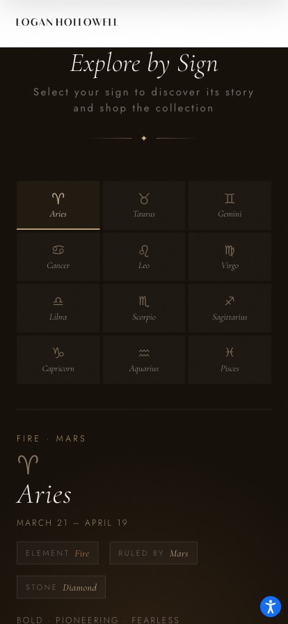
Case study — Luxury E-commerce
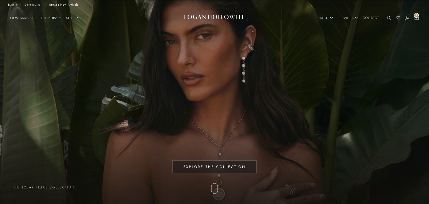
Logan Hollowell
Jewelry Website
Fine jewelry is bought slowly and worn for decades. I rebuilt the storefront around that — designed it, then shipped it in Liquid myself.
In one breath. A fine-jewelry storefront that sold $2,500+ made-to-order pieces like a generic catalog — the same homepage and the same product page for every visitor. I owned design end to end, shipped the components in Liquid and CSS, and made the storefront adapt: to where someone came from, what they had already seen, and what the piece in front of them costs.
~40%
Online sales, YoY
6.5×
Try-on ROI, first month
3
Guides designed & coded
The problem
Logan Hollowell sells one-of-a-kind stones, celestial symbolism, and made-to-order craft at $2,500 and up. The storefront sold it like a catalog.
Nearly every piece is made to order in four to six weeks, and that appeared as fine print near the shipping policy — exactly where it reads as a delay rather than as the reason for the price. Meanwhile the site had no way to save a piece, no way to judge how it would look on you, and a multi-step checkout standing between a considered decision and a confirmation.
~40%
Online sales, YoY
Year over year following the redesign. A business result with several inputs; I owned design end to end across web and mobile.
6.5×
ROI, first month
Virtual try-on, measured in its first month live.
3
Guides designed & coded
Gemstone, zodiac, and gift guides. None existed before; I designed and built all three.
What I learned
We interviewed eight participants and read through the product reviews and support threads. Two journeys separated cleanly, and neither was served.
Gift buyers arrive with a date and a ceiling. They need to know what they can afford and whether it arrives in time — in that order — which means the made-to-order timeline has to be visible before they fall in love with a piece.
Collectors return four or five times over weeks. They are not comparing Logan Hollowell to another brand; they are deciding between two stones. They needed a way to hold a shortlist across sessions and devices, and the site gave them none.
The reframe
How might a storefront selling one-of-a-kind pieces stop treating every visitor as the same person?
No two arrivals are the same
A paid click, a text message, and a collector's fourth visit all landed on the same homepage — a fixed hero above a fixed order of collections. Every one of them was a guess.
So the homepage stopped guessing. When a Google Ad, an Attentive SMS, or an Attentive email points at a collection, that collection is what the homepage leads with when the click lands — the promise made in the ad is the first thing on the page, without maintaining a separate landing page for every campaign. And for anyone who has browsed before, the collections reorder so the ones holding pieces they already viewed come first.
This is the other half of the collector finding. A wishlist answers multi-session browsing for the customer willing to curate one; reordering answers it for everyone else, and asks nothing of them. Both mechanisms were custom designed and custom coded rather than bought.
Before
- One homepage for everyone
- Fixed hero, fixed collection order
- Campaign traffic landed on the generic homepage
- No memory between sessions
- Every visit started from the same place.
After — the homepage composes itself
- From the source
- Google Ads · Attentive SMS · Attentive email → that collection leads
- From the history
- Collections reorder; previously viewed pieces surface first
- Same URL, different first screen.
Shown as a structure diagram because the work is invisible in a screenshot — two visitors see different homepages at the same URL, and a single capture can only ever show one of them.
What the site couldn't do
Three more capabilities were missing, and each one mapped to a specific thing the research said buyers were trying to do.
01
Save a piece for later
Collectors were returning four or five times with no way to hold a shortlist, so every visit restarted the search. I specified a wishlist, evaluated and integrated the plugin, and — the part that actually mattered — designed where it lived: on the product card, on the PDP beside the price, and persistent in the header so a saved list survives the gap between sessions. Wishlist-attributed revenue became a seven-figure channel in its first year.
02
Try it on
The unanswerable question in fine jewelry is scale — how a 6mm band or a lariat actually sits on your own hand or neck. No photograph resolves it, and for a made-to-order piece there is no returning it casually to find out. I spearheaded the AR virtual try-on integration, which required convincing a brand-protective client that a camera overlay would not cheapen the product. It returned 6.5× ROI in its first month live.
03
Check out in one step
Checkout was multi-step; I moved it to a single page. Not because fewer pages is universally better — for high-value orders, multi-step can lower the perceived effort per screen — but because splitting it stranded the made-to-order timeline and the authenticity and returns language on an earlier step, away from the moment of payment. On one page, the reassurance sits beside the field where the hesitation actually happens.

Saving is a full-width commitment, not a 32-pixel heart.
On a $6,850 ring the save is a considered act, so it gets the same weight
as the buy button directly above it. The heart fills, the label switches
from save to saved, and the border warms to gold over
280ms — three simultaneous confirmations, because the one thing a
shortlist cannot afford is uncertainty about whether the click landed.
aria-pressed flips with it, and the accessible name changes
from "Add to wishlist" to "Remove from wishlist."
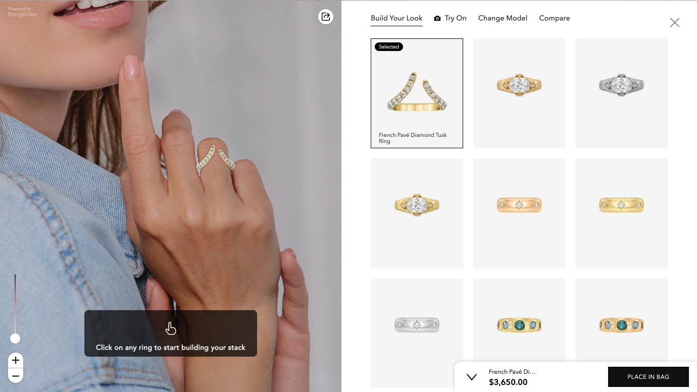
Try-on answers scale, then does something better. The piece renders at true size on a hand model you can swap, which resolves the question a photograph cannot. But the tray on the right turns it into a stacking tool — and stacking is how this customer actually wears fine jewelry, so a feature bought to reduce returns became a merchandising surface. 6.5× ROI in its first month.
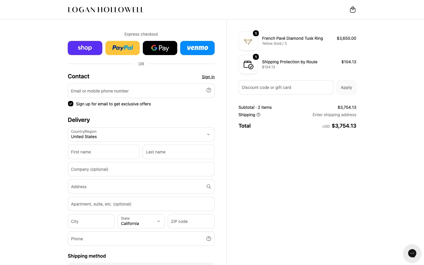
Contact, delivery, shipping and payment on one page. Express wallets sit above the fold for the returning customer; everything else resolves in a single scroll, with the order summary persistent alongside. On a $3,650 made-to-order piece, the reassurance a buyer needs and the field where they hesitate belong on the same screen.
Guides, designed and built
The catalog was organized the way the company organized inventory — by product type. But people shop for fine jewelry by stone, by birth month, by occasion, and for someone else. There was nowhere on the site to browse any of those ways.
So I designed and coded three: a gemstone guide, a zodiac guide, and a gift guide — built as Shopify sections in Liquid and CSS, using AI tooling to move from design to working code without a handoff. The gemstone guide was the real problem of the three: it needed stone properties mapped across a catalog that had never been tagged that way, so the taxonomy had to be designed before any page could be.
Before
- Browse by product type
- Rings, necklaces, earrings, bracelets
- No gemstone guide
- No zodiac guide
- No gift guide
- Lead time lived near the shipping policy.
After — two ways in
- By intent
- Gemstone · zodiac · gift · occasion
- By category
- Type, price band, ready to ship
- Both paths resolve to the same product page.
Shown as a structure diagram rather than a screenshot pair — the change is in what exists, and a side-by-side of the old site would only invite you to judge its photography.
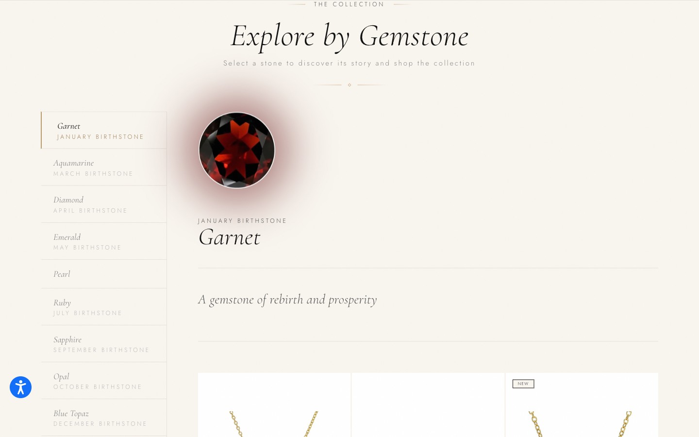
Gem guide. A stone list keyed to birth months, a detail pane, and the products carrying that stone underneath. The catalog had never been tagged this way, so the taxonomy came first and the page second.
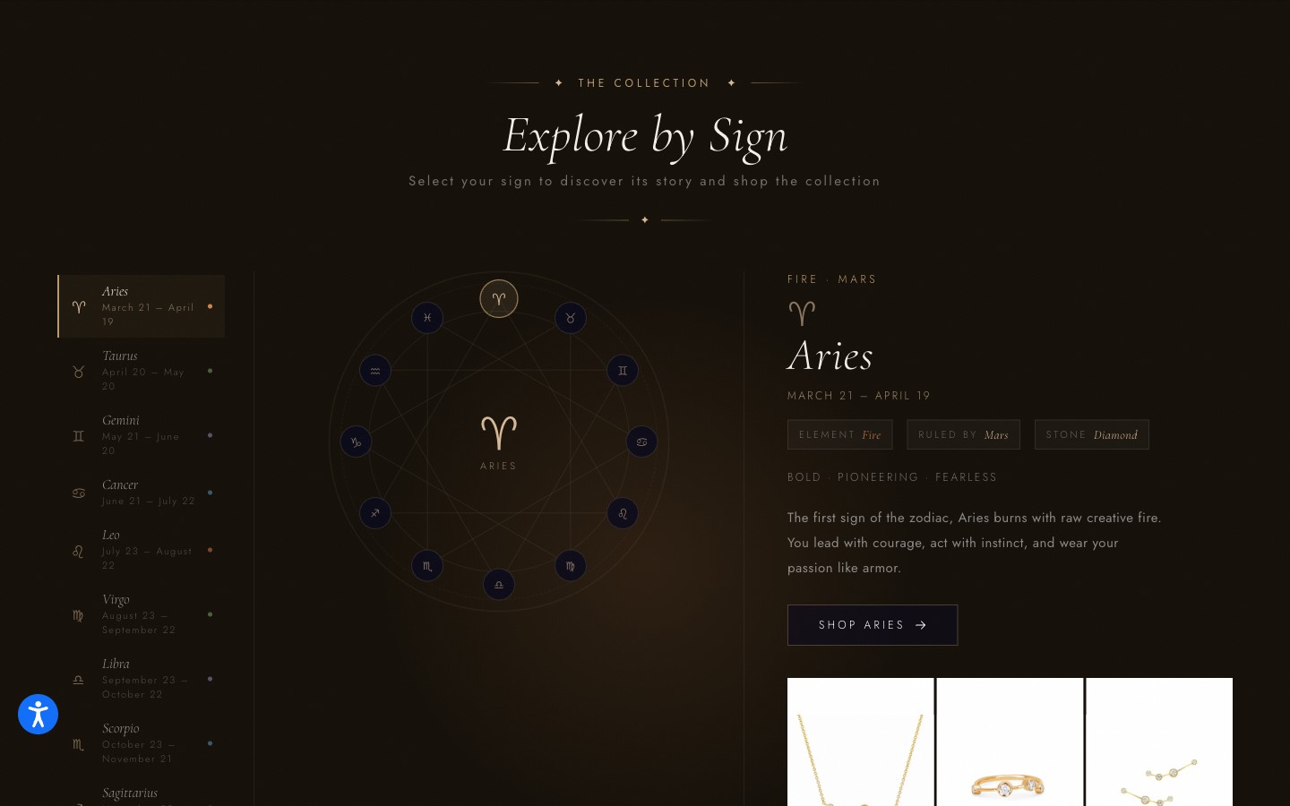
Zodiac guide. Each sign carries element, ruling planet, and stone — and that stone field links back into the gem taxonomy, so the two guides feed each other instead of duplicating content.
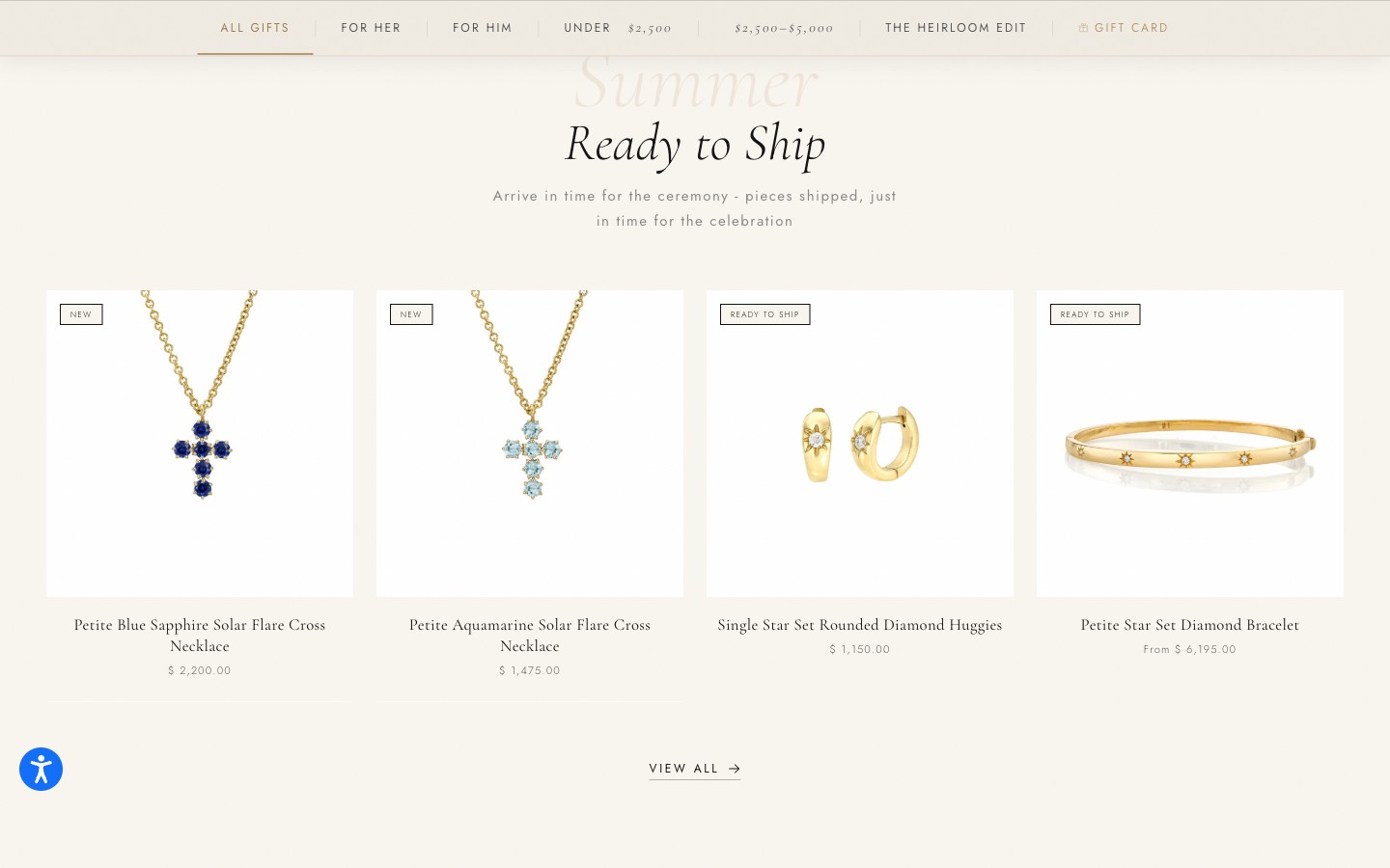
The gift guide is organized by the two things gift buyers actually bring: a budget and a deadline. The sticky sub-nav is price bands, not product categories — and Ready to Ship leads, framed as "arrive in time…" rather than as a warning about everything else. This is the research finding turned directly into navigation.
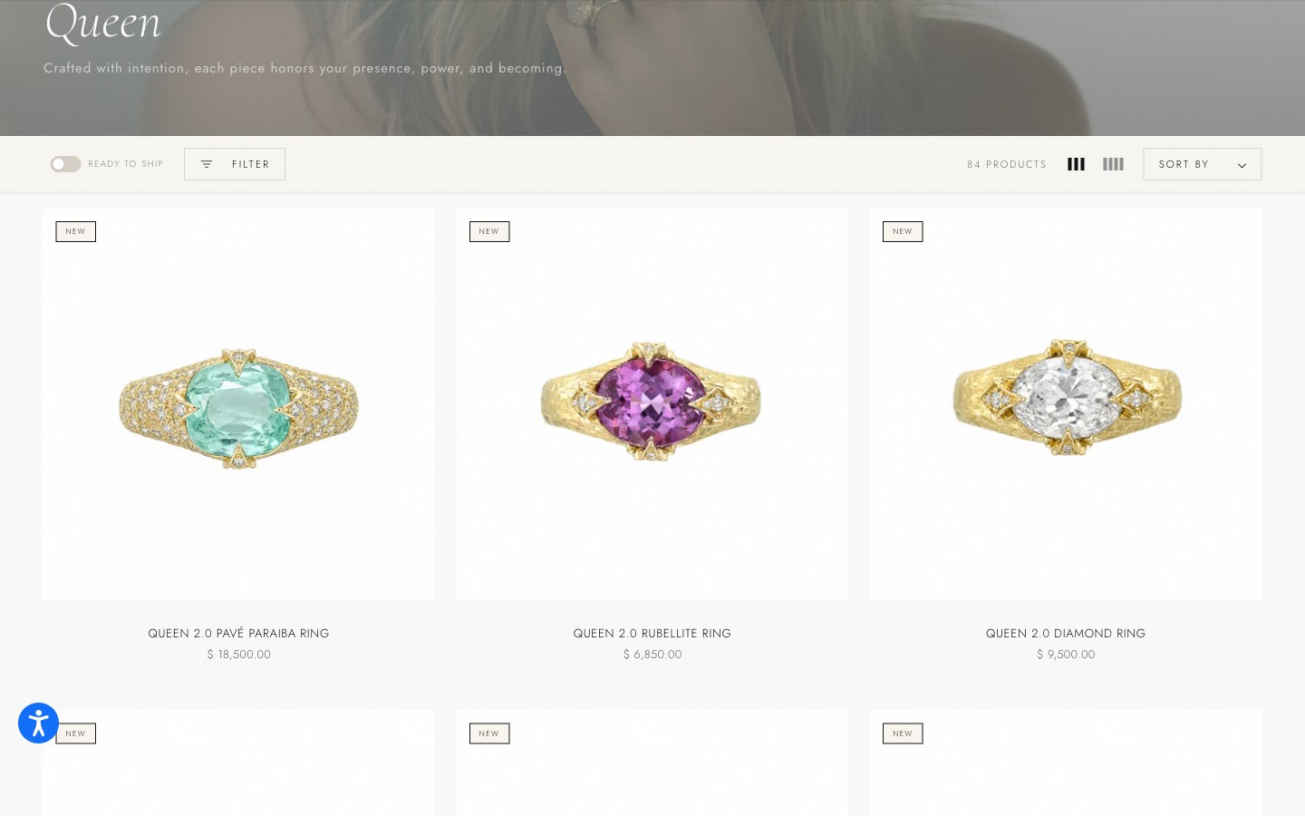
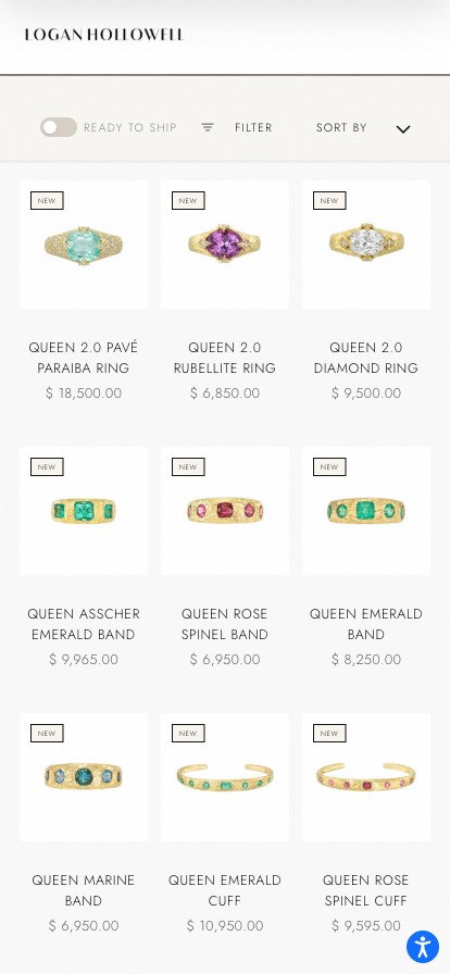
Three deliberate controls on every collection. A Ready to Ship toggle in the leftmost position, so deadline-driven buyers can filter to what exists today without the brand ever advertising a wait. A grid density switcher — three-up for browsing, four-up for scanning an 84-piece collection — because collectors and gift buyers want different densities from the same page. And a visible product count, which sets expectations before anyone scrolls. Badges stay hairline outlines: never filled, never a percentage.
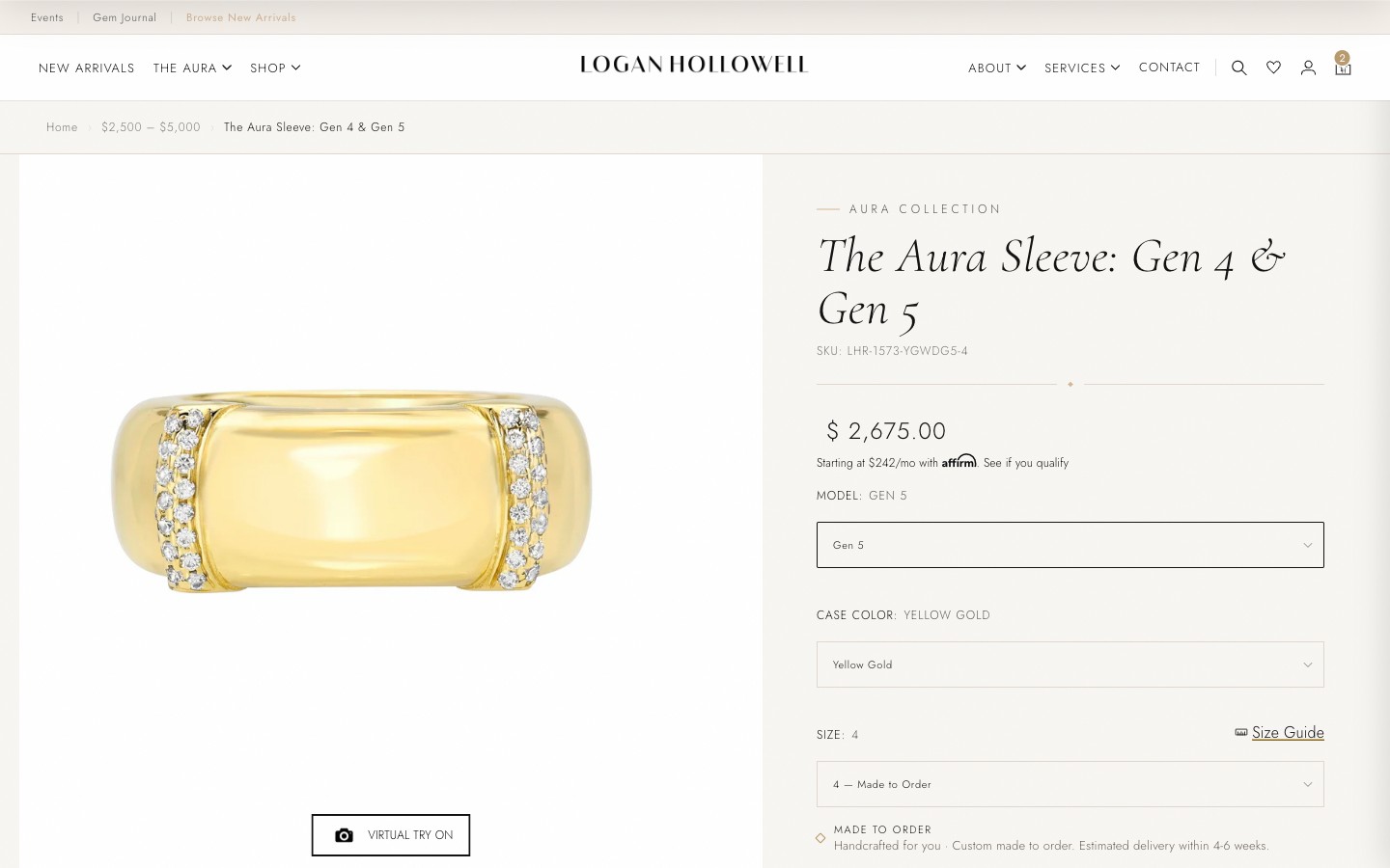
The product page answers the objection before it forms. "Custom made to order. Estimated delivery within 4–6 weeks" sits above the buy button, not after it — the lead time reads as a property of the craft while you are still deciding, rather than as a disclosure after you have committed. Affirm's monthly figure sits directly under the price, because at $2,675 the live question is affordability, not sticker shock. Try-on and the size guide answer what a photograph cannot.
One template, different price points
One product template runs from a $2,675 sleeve to a $55,650 necklace. At the top of that range, a spec list and a buy button do not carry the price.
So the template composes itself by tier. On the pieces that earn it, sections render that appear nowhere else: a note from Logan in her own voice on why this stone and this cut, and The Art of Layering, which shows the piece beside what it was designed to be worn with. Conditional sections in one template — not a second product page to maintain — designed and coded here.
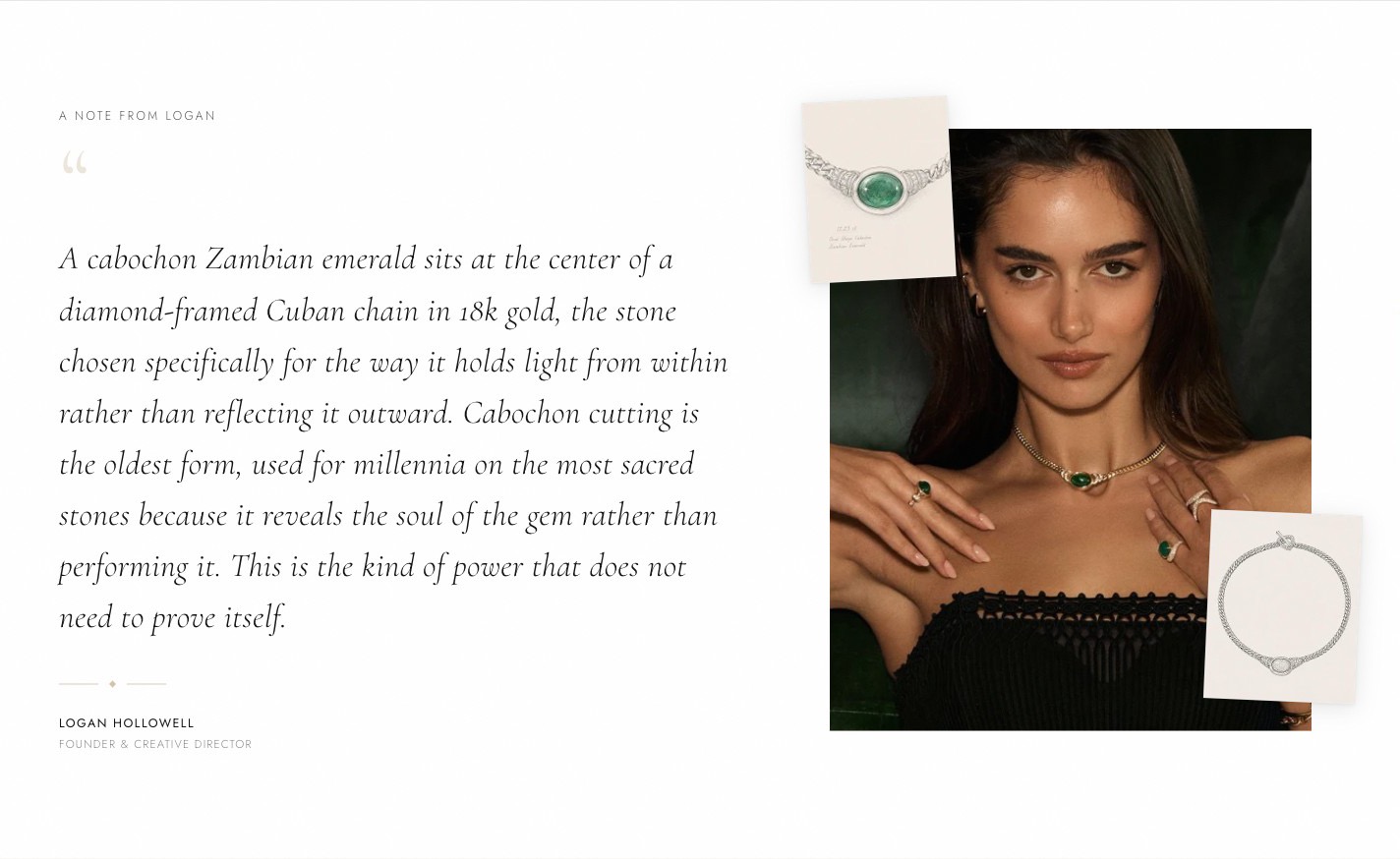
The note does what a photograph cannot. On a cabochon emerald at $55,650 the open question is not what the piece looks like — it is why it was made this way. Editorial copy from a brand reads as marketing; the same sentence signed by the person who chose the stone reads as provenance. It renders only on the pieces where that question is live, which is what keeps it from becoming a template slot every product has to fill.
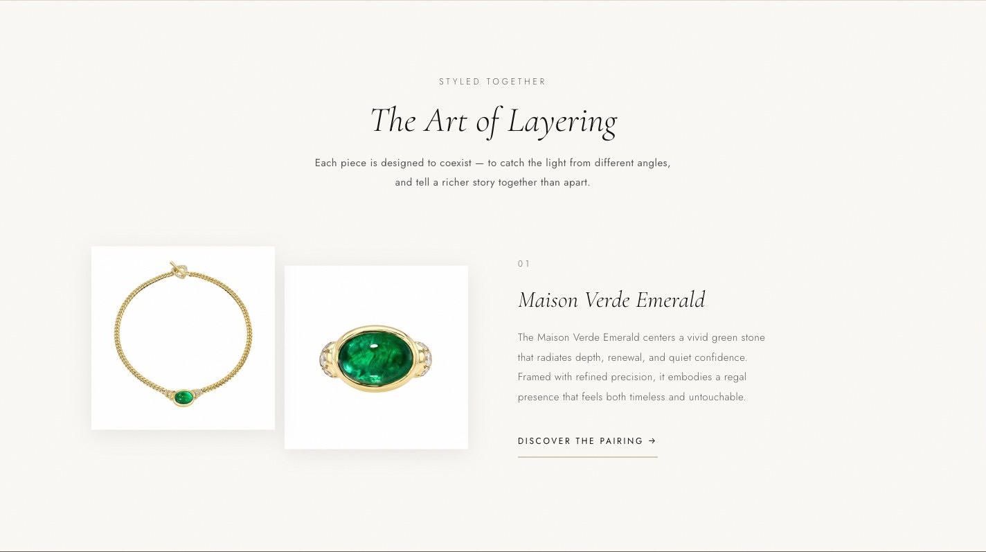
The stacking insight, on a second surface. The try-on tray let a customer build a stack themselves; this one decides a pairing for them, on the pieces where the pairing is part of the design. Same research finding, two expressions — which is the difference between a feature and a point of view about how this customer wears jewelry.
On the small screen
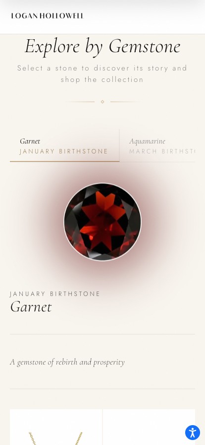
Mobile is the majority of this audience, so the guides had to survive the collapse. The two-pane selectors reflow rather than degrade: the gem guide's stone list becomes a horizontal tab strip that keeps the next stone visible, and the zodiac wheel stacks above its detail instead of shrinking to an unusable target. The Ready to Ship toggle keeps its leftmost position at every breakpoint.
What I refused to ship
Most conversion tactics are borrowed from discount retail. On a $7,850 lariat they damage the thing you are actually selling.
- Percentage-off badges and strikethrough pricing — they reframe a one-of-a-kind stone as inventory that didn't move
- Countdown timers and low-stock urgency — every one-of-one piece is low stock; saying so is noise, and it reads as pressure
- Star ratings above the fold — present, but subordinated; a rating average signals commercial scale, which is not what this brand competes on
- An exit-intent capture over the hero — the first impression of a luxury site should not be a negotiation
The tradeoff
Surfacing Ready to Ship as the first filter was the most contested decision in the project, and it is a genuine tradeoff rather than a free win.
It creates a two-tier catalog. A shopper who filters to in-stock never sees the made-to-order majority — and those are precisely the pieces that best represent the brand's craft. Logan Hollowell's team objected that we were building the storefront around the shopper who cares least about what makes the brand worth buying — someone who wants a piece today, rather than one made for them.
Why I accepted it
The alternative was worse. Without the filter, a gift buyer with a date discovers the lead time at the product page, after investing attention in something they cannot have in time — and that disappointment attaches to the brand, not to the timeline. One toggle converts a dead end into a smaller catalog, and the made-to-order pieces keep the default view, the editorial, and the homepage.
The outcome
Online sales up roughly 40%, and a storefront that arranges itself around who arrived, what they have already seen, and what the piece in front of them costs.
- A homepage composed from campaign source and browse history — custom designed and custom coded, not a personalization plugin
- A wishlist that turned multi-session browsing into a seven-figure attributed channel in year one
- AR virtual try-on returning 6.5× ROI in its first month live
- A single-page checkout that keeps lead time and returns language beside the payment field
- Gemstone, zodiac, and gift guides — designed and shipped in Liquid, none of which existed before
- One product template that earns more editorial as the piece gets more expensive, from $2,675 to $55,650
- A component set the brand kept building on, which became case study 02, the design system
Team. I was the sole product designer, and partnered closely with Vasken Mouradian, design engineer and graphic designer, on implementation and production design. I owned research, the experience, and the storefront components I built in Liquid and CSS; Logan Hollowell owned final calls on brand expression.
What I'd fix
The variant labels. The Aura Sleeve still ships as "Model: Gen 5" and "Case Color: Yellow Gold" — vocabulary inherited from Shopify's variant model and never rewritten. On a ring, "case color" is nonsense, and it is the one place on the page where the platform shows through the brand.
It was a copy problem I treated as a data problem and deferred, which was the wrong call: the fix is a per-product option label in the theme, roughly a day of the same Liquid work I was already doing. It taught me to audit inherited platform language as carefully as type and spacing, because customers never know which words I chose.