There is something profoundly human about engraving - the quiet act of making a beautiful object uniquely yours. Yet for too long, this experience on our site was hidden behind friction. Customers who wished to personalize their Logan Hollowell pieces had to navigate expandable text boxes at checkout or send emails to our sales team. It worked, but it was inelegant. It broke the spell. And in those moments of hesitation, opportunities for connection - and personalization - were lost.
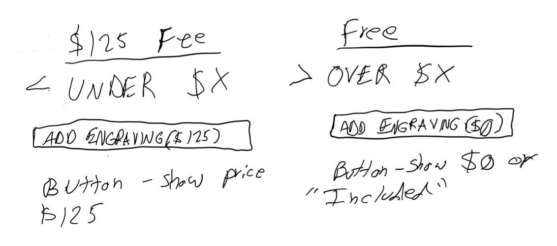
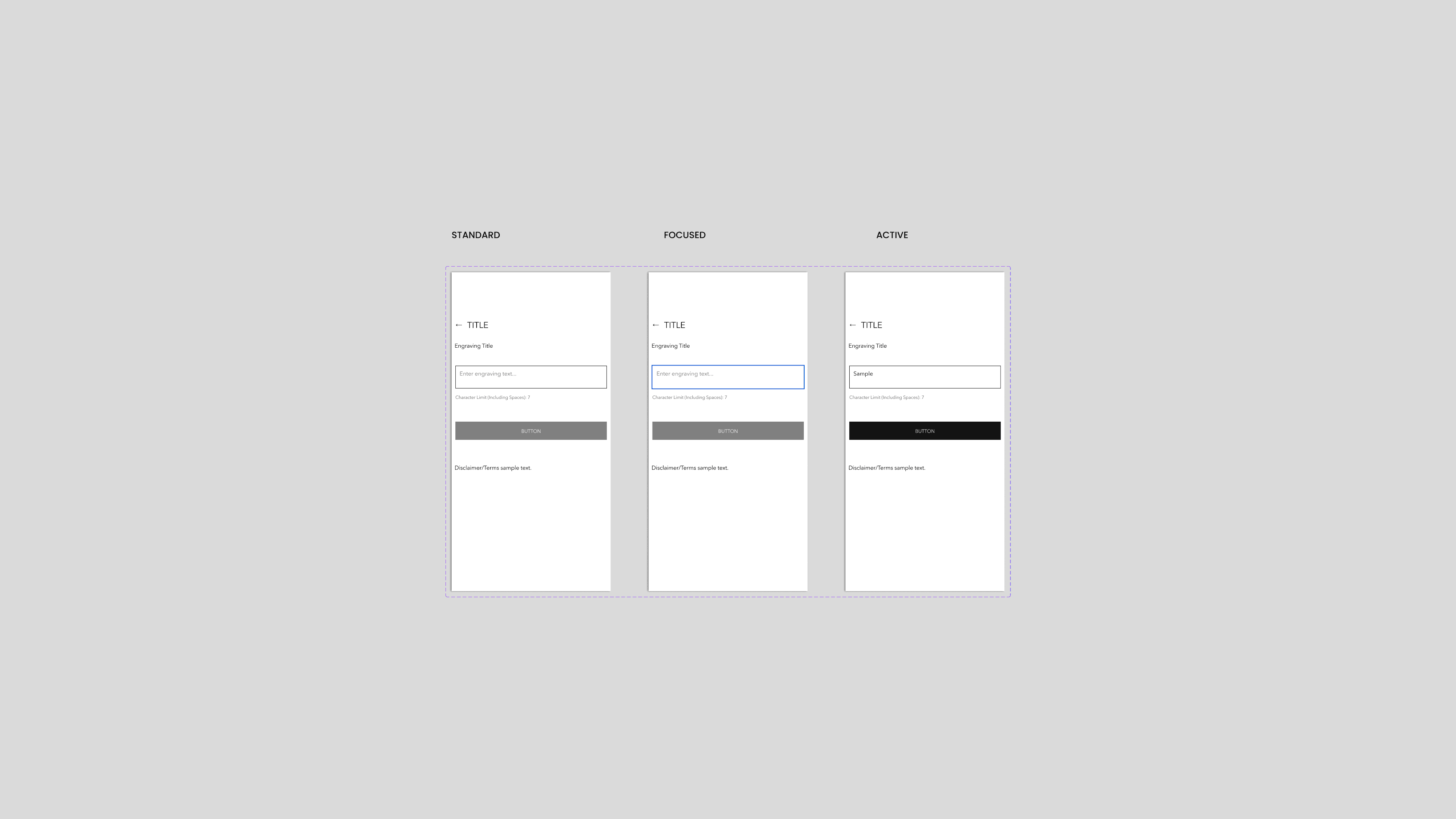
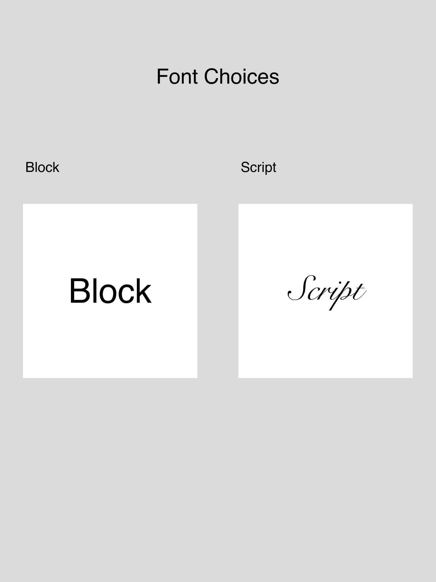
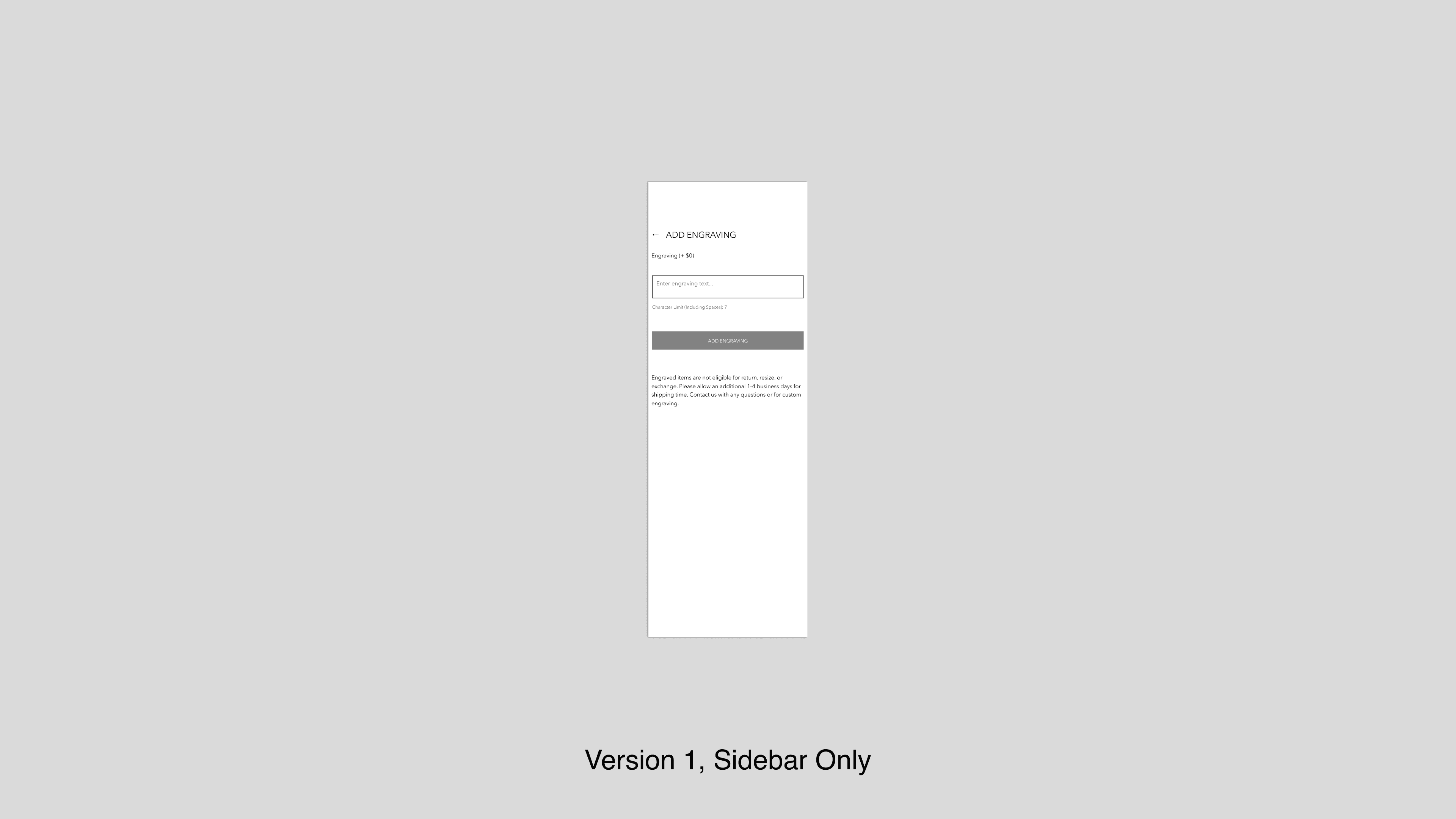
We began by listening. Competitor research gave us context, but it was conversations with potential customers that revealed the real problem: the engraving process felt like an afterthought. With the operations team, we explored many possibilities. Prototypes taught us quickly. Placing text fields directly on the product page seemed natural, but it pushed the “Add to Bag” button too far down, introducing unnecessary friction for customers uninterested in engraving. The solution emerged quietly - a refined sidebar that appeared only when needed, present without being obtrusive.
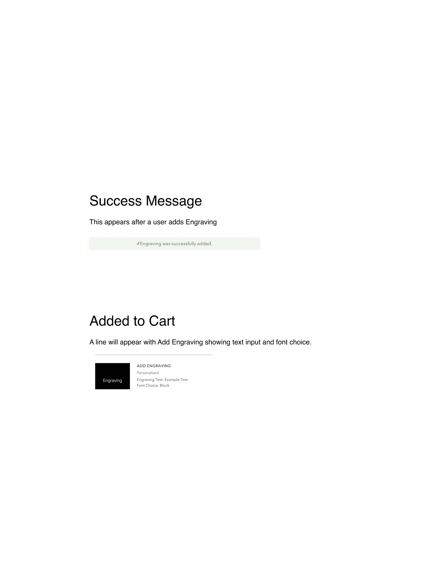
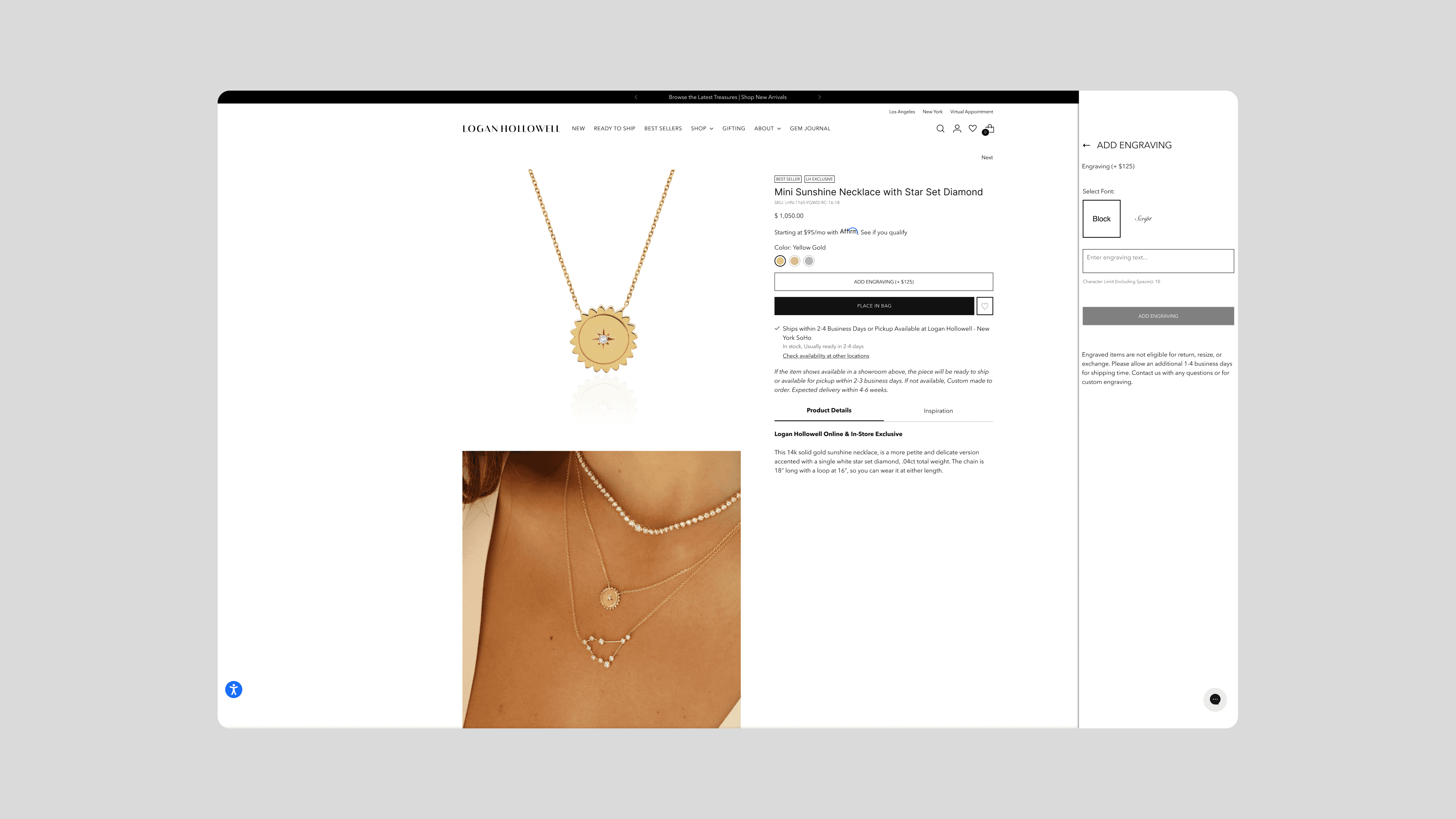
When we launched, the change was immediate. Operations no longer chased unclear or missing engraving details. Customers spoke of ease - of a process that now felt like a natural part of the shopping journey, not a technical detour. The engraving option became less of a feature and more of a moment: a small, deliberate pause to make something entirely personal.
We amplified this through our marketing, not with loud declarations, but with quiet demonstrations of its elegance on social channels. The success of this feature lies not in its novelty, but in its inevitability - a design that disappears so the customer’s story can remain in focus.
There is something profoundly human about engraving - the quiet act of making a beautiful object uniquely yours. Yet for too long, this experience on our site was hidden behind friction. Customers who wished to personalize their Logan Hollowell pieces had to navigate expandable text boxes at checkout or send emails to our sales team. It worked, but it was inelegant. It broke the spell. And in those moments of hesitation, opportunities for connection - and personalization - were lost.
We began by listening. Competitor research gave us context, but it was conversations with potential customers that revealed the real problem: the engraving process felt like an afterthought. With the operations team, we explored many possibilities. Prototypes taught us quickly. Placing text fields directly on the product page seemed natural, but it pushed the “Add to Bag” button too far down, introducing unnecessary friction for customers uninterested in engraving. The solution emerged quietly - a refined sidebar that appeared only when needed, present without being obtrusive.
When we launched, the change was immediate. Operations no longer chased unclear or missing engraving details. Customers spoke of ease - of a process that now felt like a natural part of the shopping journey, not a technical detour. The engraving option became less of a feature and more of a moment: a small, deliberate pause to make something entirely personal.
We amplified this through our marketing, not with loud declarations, but with quiet demonstrations of its elegance on social channels. The success of this feature lies not in its novelty, but in its inevitability - a design that disappears so the customer’s story can remain in focus.