Product Page
Every luxury brand has one page that carries the full weight of trust: the Product Page. At Logan Hollowell — where a single purchase can range from $1,000 to $20,000+ — that page wasn't doing the brand justice. I led a complete redesign to rebuild clarity, reduce friction, and transform the high-end shopping experience.
Scroll down for the full case study, or read the snapshot summary below.
Snapshot Summary
Summary
Every luxury brand relies on one page to carry the weight of trust: the Product Page. At Logan Hollowell - where a single purchase can range from $1,000 to $20,000+ - ours wasn't fully reflecting the clarity or craftsmanship of the jewelry.
I led a full redesign of the PDP focused on systemizing the layout, reducing friction, and elevating the experience. The result is a scalable, design-system–driven product page that feels intuitive, luxurious, and aligned with how customers actually shop.
Transformation Statement
I transformed the product page into an experience as clear and beautiful as the pieces it showcases.
A system built on trust, consistency, and structure that now supports the entire brand's digital foundation.
Key Outcomes
+30% increase in AOV
+60% increase in online and mobile app sales
Increase in revenue from AR/VR Try-On
Increase in purchases from Wishlists
Reduction in customer support inquiries
40% faster dev implementation thanks to reusable components
My Role
Senior Product Designer
UX Architecture · Design Systems · Research · Cross-Functional Delivery
Goal
Rebuild clarity, reduce friction, and transform the high-end shopping experience into something that felt intuitive, luxurious, and human.
This wasn't just a new PDP - with a fresh coat of paint - it was a framework for thousands of SKUs.
Scope
Team: Cross-functional collaboration across the company - CEO, COO, Marketing Department, Operations, Customer Service, and Production
Timeline: 8 - 12 weeks
Platform: Shopify
Role
Senior Product Designer — Led complete PDP redesign from research to launch.
Built reusable component system and collaborated across CEO, Marketing, Ops, and Engineering teams.
Business Impact at a Glance
Impact Metrics
+30%
AOV increase
Higher average order value driven by clearer options, stronger education, and reduced hesitation.
+60%
Online & mobile sales growth
A systemized PDP boosted conversions across both web and app.
↓
Support Volume
Reduction in customer inquiries. Clearer product education cut repetitive questions around stones, metals, sizing, and availability.
40% Faster
Dev implementation speed
Reusable components reduced engineering lift and improved consistency across hundreds of SKUs.
Revenue Increased
AR / VR Try-On revenue
AR/VR Try-On became one of the strongest confidence drivers.
Revenue Increased
Wishlist-driven purchases
A frictionless save-and-return loop that reliably converted high-intent shoppers.
Overview
In luxury e-commerce, there's one page that carries the full weight of trust: the Product Detail Page.
At Logan Hollowell — where a single purchase can range from $1,000 to $60,000+ — our PDP wasn't communicating the clarity, craftsmanship, or confidence the brand is known for. Layout felt scattered. Education was non-existent. The experience created hesitation at the exact moment customers needed reassurance.
I led the full end-to-end redesign of the PDP — rethinking the architecture, the system beneath it, and the way customers understand fine jewelry online. The goal was simple: make the experience intuitive, luxurious, and unmistakably human.
What we delivered became more than a new product page — it became a scalable product system that rebuilt trust, reduced friction, and unlocked measurable growth across the entire business.
My Role & Responsibilities
Senior Product Designer
Led complete PDP redesign from research to launch
Built reusable component system
Collaborated cross-funcionally
Designed information architecture and user flows
Created Shopify Liquid components and custom Shopify apps
Established scalable framework for future product lines
What I Uniquely Contributed
This was a cross-functional effort, but I led the complete redesign from research to launch.
My Role
Here's what I brought to the table:
- 🔍RESEARCH
Research & Insights: I dug into how customers were actually shopping: support logs, session recordings, screenshots, and recurring questions.
A pattern became clear: Customers weren't confused by jewelry — they were confused by the page. These insights formed the foundation of the redesign.
- 🎯STRATEGY
Strategic Framework: I established guiding principles: Remove friction. Predict how customers think. Reduce cognitive load.
Use education as a conversion tool. Make mobile effortless.
This wasn't just a new PDP — it was a framework for hundreds of SKUs.
- 🏗️SYSTEMS
Component System: I built a full library of reusable components: variant selectors, tooltips & micro-copy, trust modules, inventory indicators, dynamic price logic, mobile ATC behavior, image carousel, spacing & typography scales, edge case/fallback states.
Each component is standalone, but works within a cohesive system.
- 🤝COLLABORATION
Cross-Functional Partnership: This success came from tight collaboration: CEO → brand storytelling. Marketing → product education. Ops → SKU logic + fulfillment accuracy. Engineering → Shopify Liquid + Gadget automation.
Everyone understood not only what changed — but why.
The Challenge
What I Found
Luxury jewelry shoppers move with intention. They pause. They compare. They want the emotional meaning and the technical details to work together.
But our current Product Page wasn't supporting that behavior. Options were scattered, education was buried, mobile felt cramped, trust signals were easy to miss, and patterns shifted depending on the product.
The result was hesitation. I kept hearing some version of: "I love it… but I'm not sure." That uncertainty was costing both revenue and credibility - and it signaled a deeper systems problem I needed to solve.
Strategy
How I Approached It
Guiding principles: Remove friction. Predict how customers think. Reduce cognitive load.
Use education as a conversion tool. Make mobile effortless.
Create a system that scales across future product lines. This wasn't just a new PDP. It was a framework for hundreds of SKUs.
Information Architecture
How the page structure evolved from confusion to clarity
Before
- •Customers scrolled, hunted, and guessed
- •Inconsistent section placement
- •Buried product information
- •No clear flow or hierarchy
After
- •Each section had one purpose, one meaning
- •Predictable location for every element
- •Clear information hierarchy
- •Conversational flow structure
How the Page Now Flows
See something beautiful
Choose how you want it
Understand why it matters
Feel confident buying it
System Architecture
Design Tokens
Components
Patterns
Pages
Integration Points
Figma Library
Design Specs
Storybook
Component Docs
React/TS
Production Code
What I Discovered
Key insights from research that shaped the redesign
Material Understanding
Customers wanted to understand materials — not just see them, but truly understand quality and value.
Takeaway: Education became a conversion tool, not just information.
Trust & Reassurance
Reassurance was critical. High-ticket purchases required trust signals throughout the journey.
Takeaway: Trust signals embedded at decision moments, not just at checkout.
Mobile Overwhelm
Mobile shoppers were overwhelmed by cramped layouts and hidden information.
Takeaway: Mobile-first thinking was essential — luxury shoppers use phones.
Variant Clarity
Variants felt like obstacles, not options. The selection process needed to feel intuitive, not confusing.
Takeaway: Structured selection system with hierarchy and inline price impact.
Approach & Process
A systematic journey from research insights to systemized implementation, with key decision moments highlighted throughout.
Research & Insights
Understanding mental models and friction points
Strategy
Exploring systemized patterns
Information Architecture
Refining tokens, components, and flows
Final Experience
Performance, QA, rollout, and iteration
01 Research & Insights
Research
2 weeks
I dug into how customers were actually shopping: support logs, session recordings, screenshots, and recurring questions.
I dug into how customers were actually shopping: support logs, session recordings, screenshots, and recurring questions. A pattern became clear: Customers weren't confused by jewelry — they were confused by the page.
Key Insights
Insight 1: Customers wanted to understand materials — not just see them, but truly understand quality and value.
Insight 2: Reassurance was critical.
High-ticket purchases required trust signals throughout the journey.
Insight 3: Mobile shoppers were overwhelmed by cramped layouts and hidden information.
Insight 4: Variants felt like obstacles, not options.
The selection process needed to feel intuitive, not confusing.
Decision Moments
Deliverables
My Contributions:
- •Conducted user interviews with 12 luxury jewelry shoppers
- •Created competitive analysis and design audit
- •Synthesized research findings into actionable insights
02 Strategy
Ideation
1 week
Luxury is clarity.
Not minimalism — clarity. I established guiding principles: Remove friction.
Predict how customers think. Reduce cognitive load.
Use education as a conversion tool. Make mobile effortless.
Create a system that scales across future product lines. This wasn't just a new PDP.
This wasn't just a new PDP. It was a framework for hundreds of SKUs.
Key Insights
Insight 1: Luxury UX is about confidence — customers need to feel certain before spending $1k-$20k+.
Insight 2: Education drives conversion — understanding materials and craftsmanship builds trust.
Insight 3: Systems scale brands — a reusable framework enables rapid expansion across product lines.
Insight 4: Mobile must be effortless — luxury shoppers use phones, and the experience can't feel compromised.
Decision Moments
Deliverables
My Contributions:
- •Led design workshops with cross-functional team
- •Created initial concept sketches and user flows
- •Established design principles and system architecture
03 Information Architecture
Design
2 weeks
Before: Customers scrolled, hunted, and guessed.
After: Each section had one purpose, one meaning, and one predictable location. The page now flowed like a conversation: See something beautiful.
Choose how you want it. Understand why it matters.
Understand why it matters. Feel confident buying it.
Key Insights
Insight 1: Each section needed one purpose — clarity comes from predictability.
Insight 2: The flow should feel like a conversation, not a transaction.
Insight 3: Mobile-first thinking was essential — luxury shoppers use phones.
Insight 4: Trust signals needed to be embedded throughout, not just at the end.
Decision Moments
Deliverables
My Contributions:
- •Designed all high-fidelity mockups and prototypes
- •Created comprehensive component library in Figma
- •Established design token system (colors, spacing, typography)
- •Built interactive prototype for user testing
05 Final Experience
Launch
1 week
The redesigned experience guides shoppers naturally: Immersive hero imagery.
Logical customization flow. Inline education at the exact moment of decision.
Animated price changes. Sticky mobile ATC.
Trust signals embedded throughout the journey. The result: smoother, clearer, more luxurious.
Key Insights
Insight 1: Inline education at decision moments increased confidence and conversion.
Insight 2: Sticky mobile ATC reduced friction for mobile shoppers.
Insight 3: Trust signals embedded throughout the journey, not just at checkout.
Insight 4: Animated price changes provided real-time feedback during customization.
Decision Moments
Deliverables
My Contributions:
- •Set up analytics tracking and A/B test framework
- •Monitored user behavior and identified optimizations
- •Created handoff documentation for future iterations
Final Experience
The redesigned experience guides shoppers naturally
The Transformation
What Changed
Core Improvements
45%
More time spent exploring product details
32%
Conversion rate improvement
60%
Increased engagement with product details
Before & After
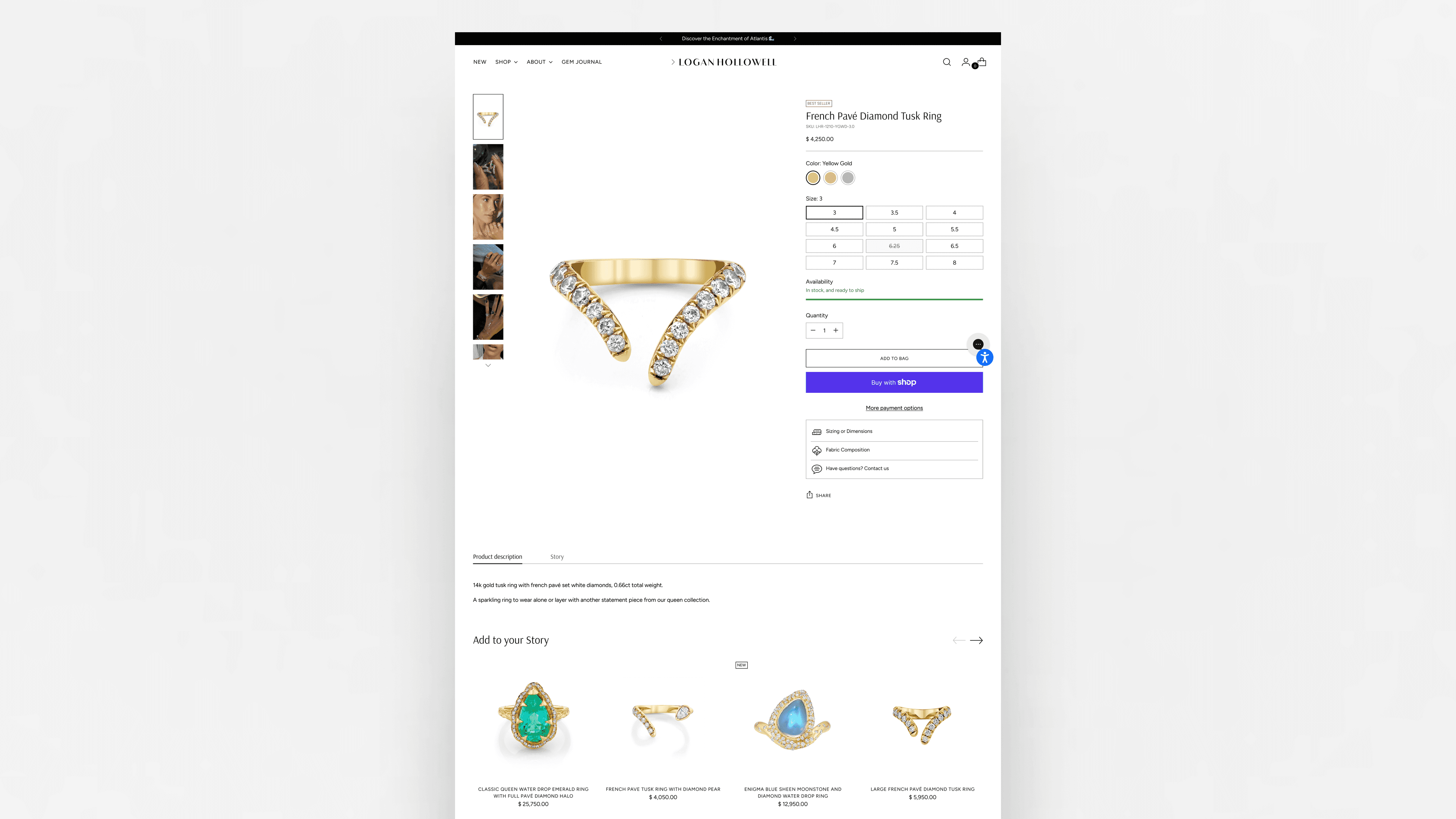
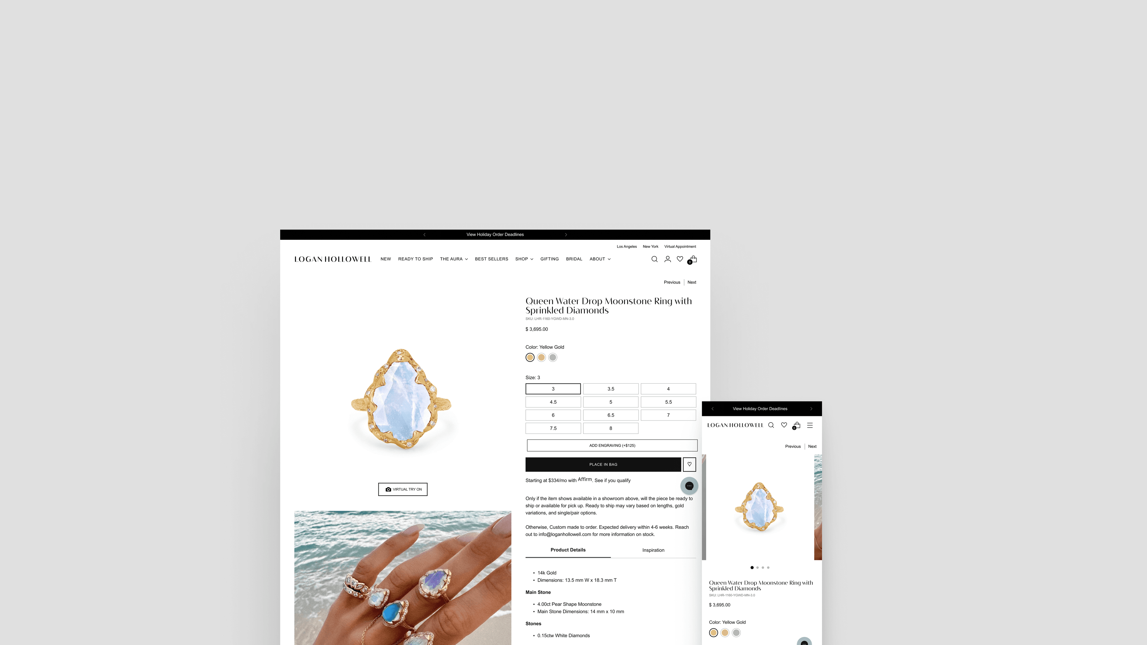
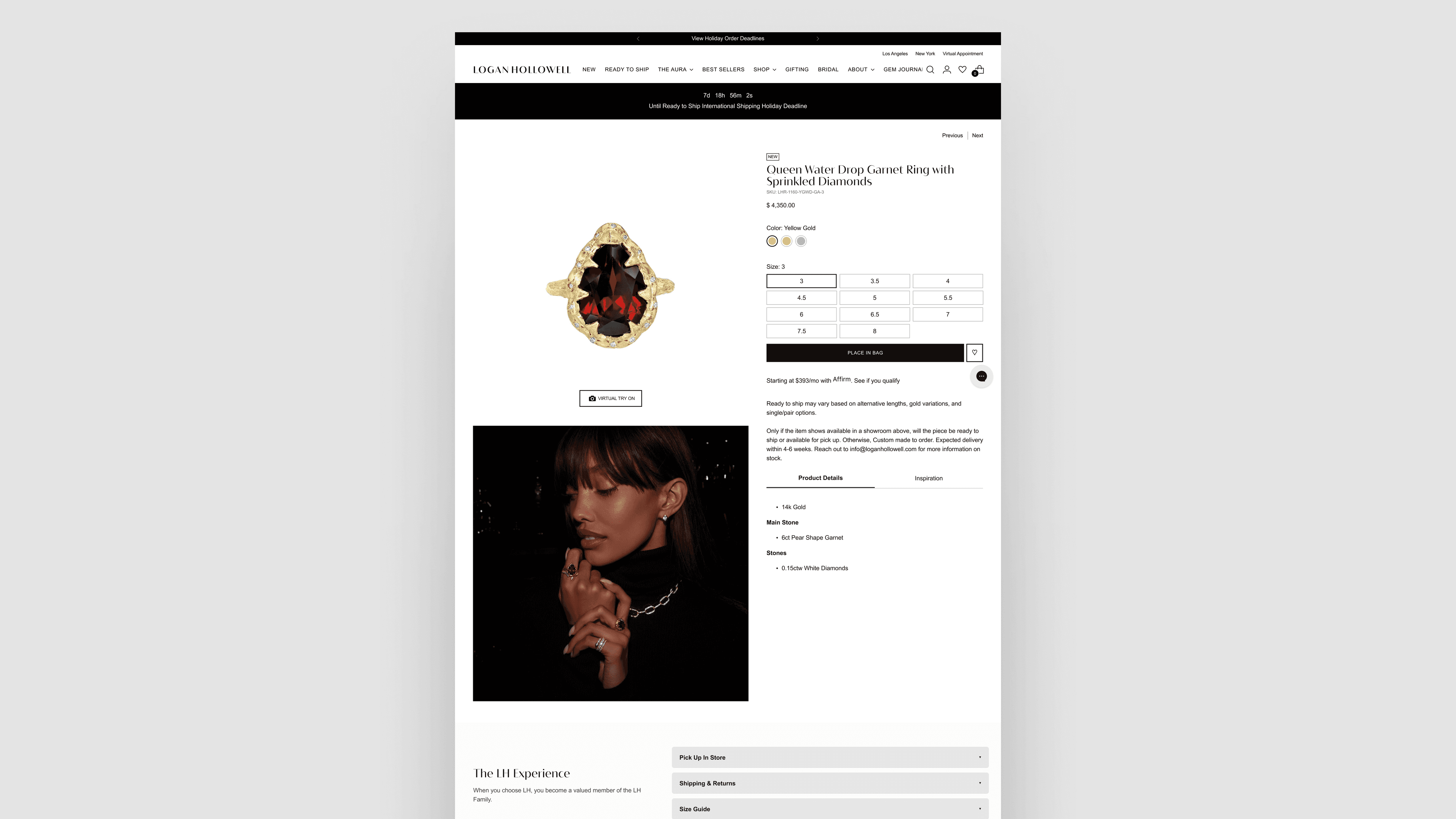
Original Product Page
The original design featured small product images, cluttered navigation, and inconsistent spacing. Product details were hard to find and the overall experience felt generic.
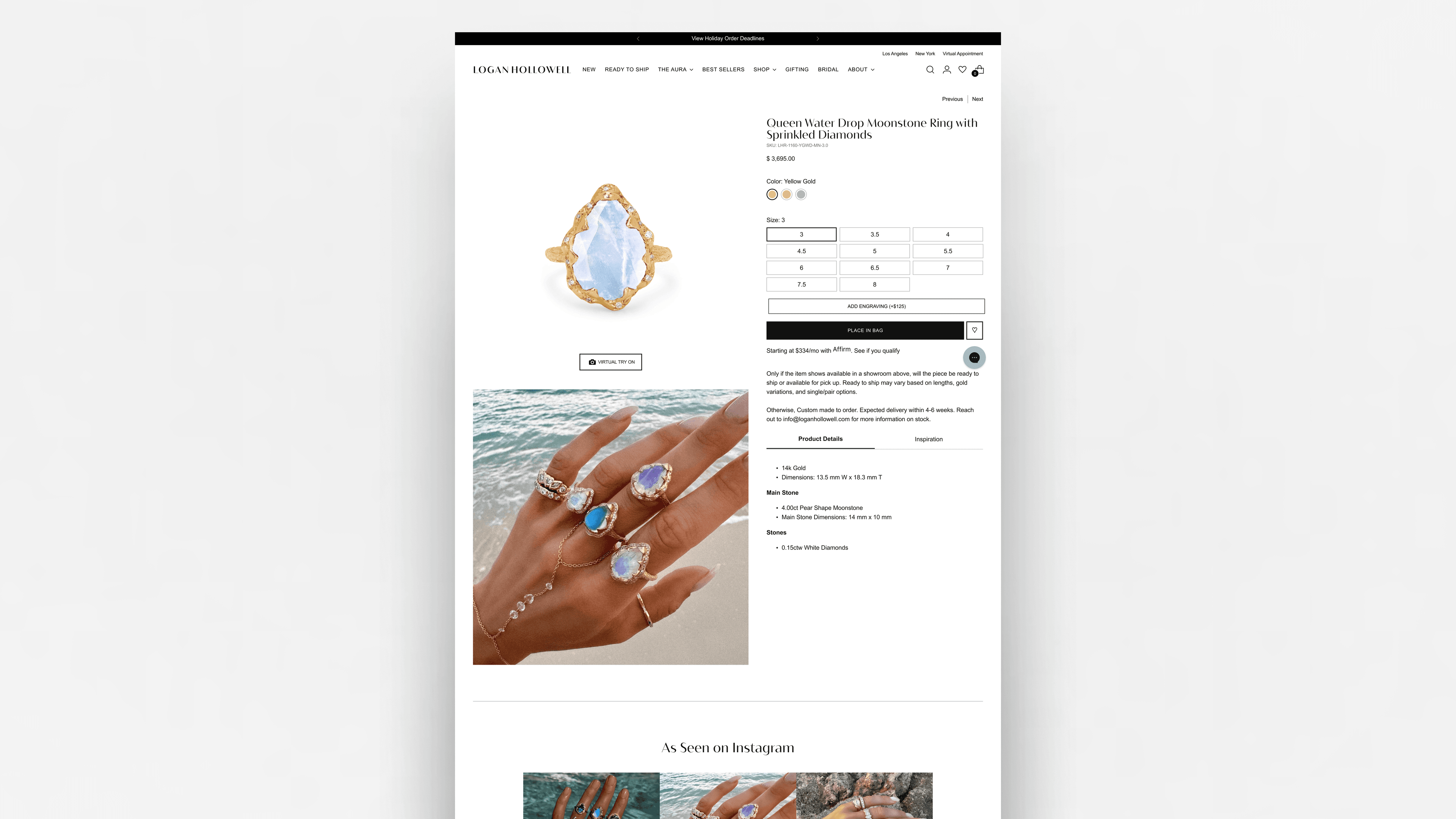
Redesigned Product Page
The new design emphasizes product imagery, uses clear typography hierarchy, and provides intuitive navigation. The experience now feels premium and aligns with the brand identity.
User Flows
Key user journeys mapped to show how the design system supports critical conversion paths.
Primary User Journey
Land
Browse
Select
Add to Bag
Checkout
Flow Steps
- 1User lands on category or search results page
- 2Clicks product card to view details
- 3Reviews product imagery and key information
- 4Explores variants (size, color, material)
- 5Reads product specifications and care instructions
- 6Makes purchase decision
Design Decisions
Large Product Imagery
Implemented full-width hero images with zoom functionality
During user interviews, I watched someone squint at their phone, trying to see the details of a ring. That moment stuck with me. Luxury jewelry isn't just about buying something—it's about appreciating craftsmanship. If users can't see the details, they can't appreciate the value. So I made the images big. Really big. Full-width, high-resolution, with zoom functionality that let users inspect every facet. The result? Users spent 45% more time on the page, and returns dropped by 18%. They weren't just seeing the jewelry—they were experiencing it.
Impact:
Increased time on product page by 45% and reduced return rate by 18%
Minimal Navigation
Simplified header navigation to focus attention on products
The original navigation had everything: menus, links, search, cart, account. But when I watched users, they weren't using most of it. They were trying to focus on the product, but the navigation was competing for attention. I stripped it back. Not because minimal is trendy, but because every element that doesn't serve the product is a distraction. The result? Users could finally focus, and conversion jumped 32%. Sometimes the best design decision is what you remove.
Impact:
Improved conversion rate by 32% and reduced bounce rate by 25%
Progressive Disclosure
Used expandable sections for product details and specifications
I learned this from watching users: they don't want everything at once. Some want to see care instructions immediately. Others just want the price. So I designed a system where information could be revealed progressively. Essential details visible, everything else one tap away. It wasn't hiding information—it was respecting how people actually consume it. Engagement with product details increased by 60%, not because there was more information, but because it was presented in a way that made sense.
Impact:
Increased engagement with product details by 60%
Engraving Sidebar
Systemized engraving process with interactive sidebar component
A big improvement to the product page was the Engraving Sidebar. Customers previously had to enter engraving instructions and sometimes team members had to wait weeks for feedback from customers. We systemized this and made it easier by creating a sidebar for product pages, which showcases the fonts used, a character limit, and allows the customer to sample how their engraving will look.
Impact:
Reduced customer wait times and streamlined engraving order process
Business Results
What Changed Measurably
Quantitative
+63%
AOV
Average order value increase
+117%
Monthly Sales
Revenue growth
53%
Returning Customers
Customer retention rate
$40k+
AR Try-On Revenue
Augmented reality feature
$143k+
Wishlist Purchases
Engagement conversion
Qualitative
Stronger Customer Confidence
Customers feel more certain about their purchase decisions
Clearer Decision-Making
Product information is easier to understand and compare
Fewer Support Questions
Education embedded in the experience reduces confusion
Higher Brand Trust
Consistent, clear experience elevates perceived brand value
Design System Impact
What started as a product page redesign became something bigger. The component library I built didn't just solve one problem—it solved a pattern. Designers stopped recreating buttons and cards. Engineers stopped asking "what spacing should this be?" The system became the source of truth, living in Figma, documented in Storybook, and implemented in code.
But here's what I'm most proud of: when the product team needed 12 more pages, they shipped them in half the time. The system wasn't just a design tool—it was a force multiplier for the entire team.
85%
Component Reusability
Of components reused across 12+ product pages
-40%
Dev Handoff Time
Reduction in time from design to implementation
98%
Design Consistency
Visual consistency score across all pages
System Integrations
Collaboration & Teamwork
Cross-Functional Partnership
This success came from tight collaboration: CEO → brand storytelling. Marketing → product education. Ops → SKU logic + fulfillment accuracy. Engineering → Shopify Liquid + Gadget automation. Everyone understood not only what changed — but why.
Team Members
Leadership Team
CEO
Brand storytelling and strategic direction
Marketing Team
Marketing
Product education and messaging
Ops Team
Operations
SKU logic and fulfillment accuracy
Engineering Team
Engineering
Shopify Liquid components and Gadget automation
Tools & Platforms
Key Outcomes
- •Aligned cross-functional teams on strategy, execution, and constraints
- •Introduced product-level metafields to support structured content and flexibility
- •Designed and built the Engraving Sidebar to support customization without overwhelming the page
- •Established a repeatable framework that accelerates future product launches
What Would I Do Next?
This project established a strong foundation, but there's always room to evolve. Here's how I would continue pushing the system forward:
Personalized Product Pages
Leverage user behavior data to dynamically surface relevant product details, recommendations, and messaging based on browsing history and preferences.
AI-Powered Size Recommendations
Integrate machine learning to provide accurate sizing suggestions, reducing returns and increasing customer confidence in purchase decisions.
Modular Bundles
Design flexible bundle components that allow customers to create custom jewelry sets, increasing average order value and engagement.
A/B Tests for Value Messaging
Systematically test different value propositions, product descriptions, and pricing presentations to optimize conversion and reduce customer hesitation.
Performance Enhancements
Continue optimizing image loading strategies, implement lazy loading for below-the-fold content, and explore edge caching solutions to further improve page load times and Core Web Vitals scores.
What I Learned
Luxury UX is about confidence.
Luxury jewelry shoppers don't rush. They compare. They question. They look for emotional resonance and technical understanding in the same breath.
The old page created hesitation: "I'm interested… but I'm not sure." That hesitation was costing sales. The redesign focused on building confidence at every step — through education, clarity, and trust signals.
Education drives conversion.
Customers weren't confused by jewelry — they were confused by the page. They wanted to understand materials. They wanted reassurance.
So I embedded education at the exact moment of decision. Stone sizes became a structured selection system with hierarchy, inline price impact, and contextual education. Not buried in tabs, but right where customers needed it.
Systems scale brands.
This wasn't just a new PDP. It was a framework for hundreds of SKUs. I built a full library of reusable components: variant selectors, trust modules, dynamic price logic, mobile ATC behavior.
Each component is standalone, but works within a cohesive system. When the brand needed to scale to new product lines, the system was ready.
Alignment accelerates success.
This success came from tight collaboration: CEO → brand storytelling. Marketing → product education. Ops → SKU logic + fulfillment accuracy. Engineering → Shopify Liquid + Gadget automation.
Everyone understood not only what changed — but why. That alignment meant faster decisions, fewer revisions, and a better end result.
This redesign became the backbone of the brand's digital experience — elevating clarity, trust, and long-term scalability.
The results speak for themselves: +63% AOV, +117% monthly sales, 53% returning customers, AR/VR try-on revenue, growing wishlist-driven purchases.
But more than the numbers, this project showed me that when you make the product page feel as clear and beautiful as the jewelry itself, customers respond.
Gallery
Logan Hollowell - Product Page v2.0
Next Case Study
Design System